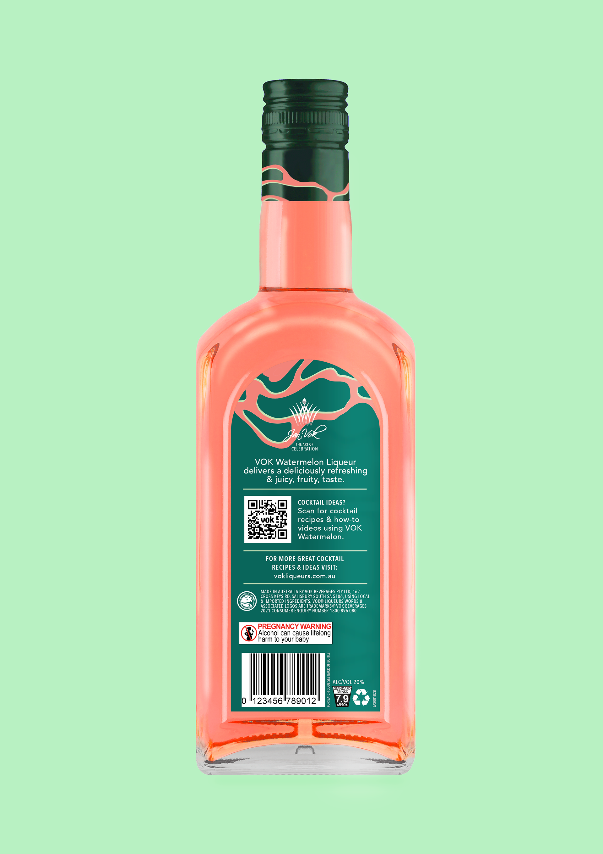
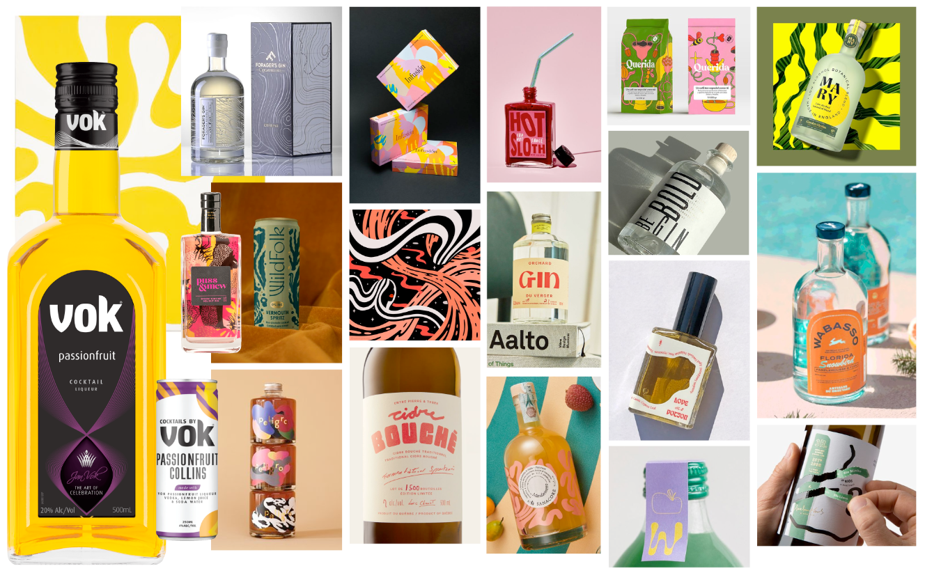
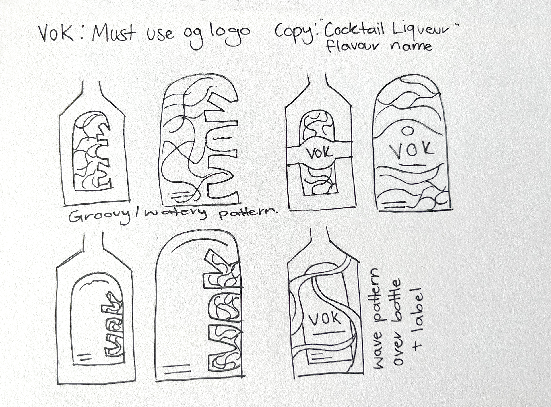
Redesign Brief - using the original logo, redesign a local (Adelaide based) alcoholic brand/packaging to appeal to a younger target market.
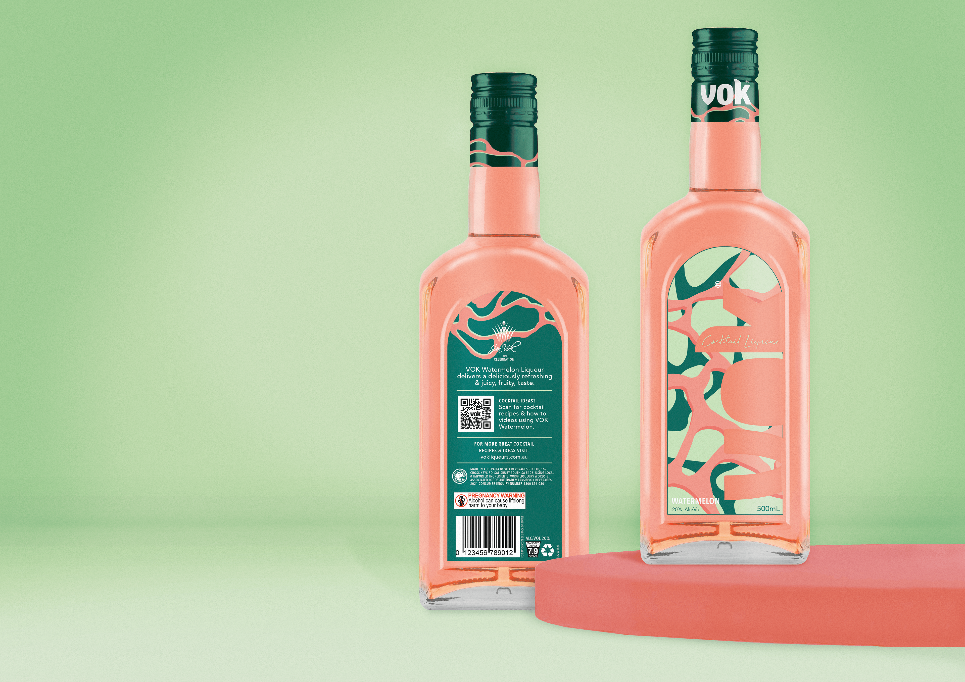
Considering the logo had to stay, I decided to make the logo a large part of the design, transforming it into a cut-out sticker label with the colourful alcohol filling it in. The flowing shapes and colours work to represent water to create a refreshing feel with the goal to be the go-to party inclusion.
Development
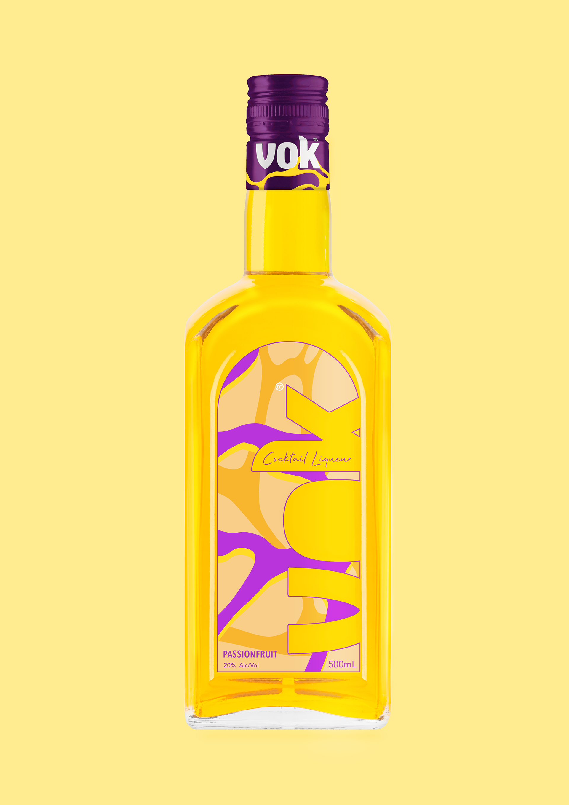
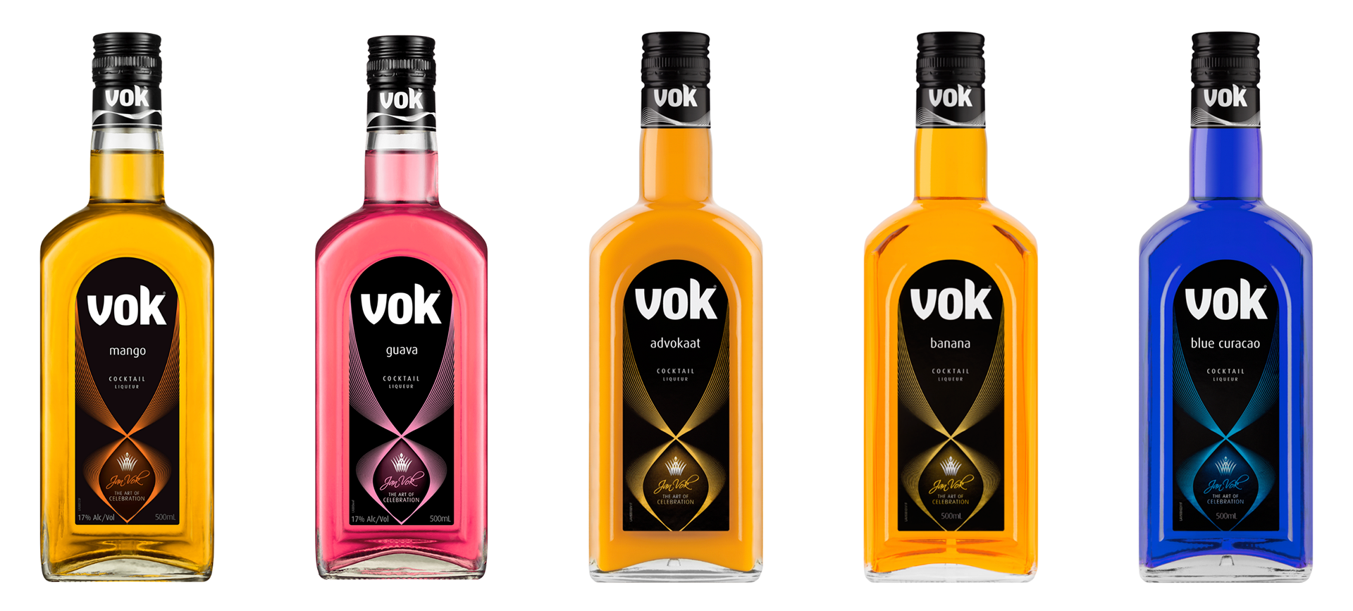
Flavour Applications